The Colorful Mosaic of a Thankful Caregiver
How one columnist is relaxing and expressing gratitude this Thanksgiving
Written by |

Selecting a coloring book wasn’t something I rushed as a child. Testing my parents’ patience, I would carefully page through many books until I found the perfect one with the most appealing pictures. I intended to color every drawing in the book, so selecting the right one was important, and I rarely missed completing my goal.
Mom and Dad would ooh and ahh over my finished works of art, and with great confidence, I would tell them, “I’m going to keep coloring even when I’m an adult!”
I wish my parents had patented my idea because little Colleen was onto something. I think there’s a more extensive assortment of coloring books for adults than children these days.
What’s the appeal for grown-ups? Coloring books marketed with titles such as “Stress Less Coloring,” “Calming Doodles,” and “Stress Relieving Designs.”
Some patients or caregivers would enjoy these gifts, so keep that in mind this Christmas, and don’t forget to stuff their stockings with markers, colored pencils, or crayons.
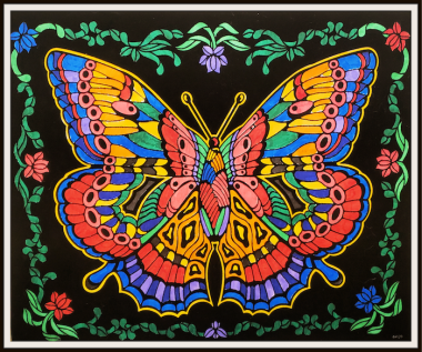
Another coloring option for people of all ages is fuzzy velvet coloring posters, like the one you’ll see below. These are my go-to when I want to select the perfect picture to fit my mood or occasion.
Because we celebrate Thanksgiving this week in the U.S., I wanted to relax and color something that would help me express what I’m most thankful for and why.
“Mosaics are made from broken pieces, but they’re still a work of art. And so are you.” – Unknown
This quote inspired me to choose a butterfly mosaic.
Patients aren’t the only ones who sometimes feel broken. So do caregivers — so do most human beings. We’re all works of art.
As a caregiver who’s also a daughter, wife, mother, and friend, I know I’m not alone in holding my broken pieces together. I have co-creators to thank.
I designated a color for each of them and went to work on my fuzzy velvet poster. The mosaic slowly transformed into a beautiful butterfly.

A mosaic of thanks colored by Colleen. (Photo by Colleen Steele)
Red represents family.
To me, family includes those bound to me by blood and other special people in my life who love me unconditionally. Without my family members, I wouldn’t be much of anything. They’re my strength and refuge, broken wing healers, compass, the smile on my face, and sometimes the tears in my eyes — but they’re always at the heart of who I am.
Life without them would be hard, so I gave them a color that’s hard to miss.
Pink represents friends.
If it looked somewhat like a circle, I colored it pink.
What would I do without my circle of friends? They listen when I need to vent, make me laugh when I want to cry, and have my back when others don’t. I’m thankful for genuine, honest, kind friends who bring out the best in me when I’m around them.
Periwinkle and purple represent PHamily and PHriends.
My son Cullen was diagnosed with pulmonary hypertension (PH) when he was 8. Thanks to an online PH family support group, I quickly experienced the value of having PHriends. There are so many in the community with whom I feel a strong bond despite never meeting in person.
Cullen and I became best PHriends with a small group of PH children and their parents when they were treated at the same hospital. The more we went through together, the stronger the bond became. When the patients received transplants months apart, we changed from friends to PHamily.
I’m beyond grateful for PHamily, old PHriends, and the new ones I’ve made through the Pulmonary Hypertension News Forums. For them I used periwinkle, the color of the PH awareness ribbon.
Green represents the donor of Cullen’s heart and lungs.
The mosaic wouldn’t be complete without the organ donor who saved Cullen’s life and prevented irreparable damage to mine.
Blue represents deceased loved ones.
The death of a friend or relative leaves an emptiness I’m certain will never be restored. That holds to a certain degree, but through the grieving process, I’m reminded that love never dies.
These grief-stricken broken pieces of me are mended by memories and a personal dedication to take something from the life of the admired decedent and apply it to my own.
Orange represents happy experiences, and black represents challenging ones.
Happy experiences are quick void fillers, but what about the challenging ones? How do they fit into the mosaic? They’re important reminders of how cracks have formed and what I did or didn’t do to keep them from spreading. In some ways, they prevent other cracks.
Yellow represents faith.
My faith in God forms the shape of who I am. It’s always there, even when I can’t see it.
“‘What if I fall?’ Oh but my darling, what if you fly?” — Erin Hanson
Note: Pulmonary Hypertension News is strictly a news and information website about the disease. It does not provide medical advice, diagnosis, or treatment. This content is not intended to be a substitute for professional medical advice, diagnosis, or treatment. Always seek the advice of your physician or other qualified health provider with any questions you may have regarding a medical condition. Never disregard professional medical advice or delay in seeking it because of something you have read on this website. The opinions expressed in this column are not those of Pulmonary Hypertension News or its parent company, Bionews, and are intended to spark discussion about issues pertaining to pulmonary hypertension.


Leave a comment
Fill in the required fields to post. Your email address will not be published.